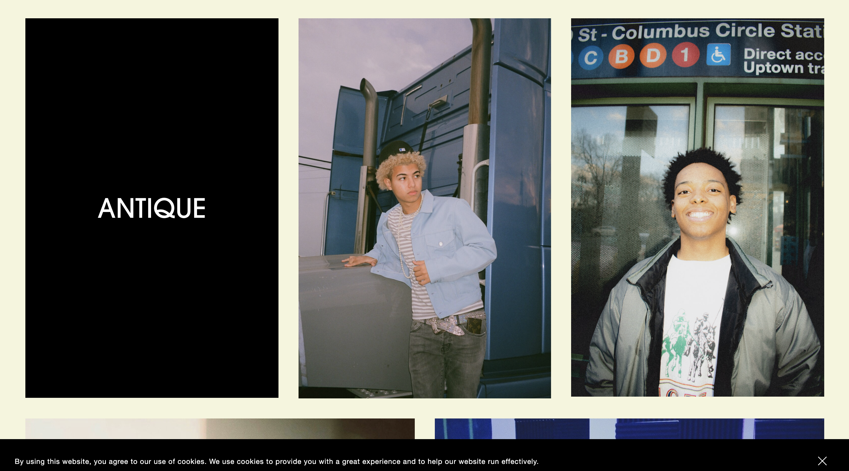
Today we’re going to go over how to turn the poster image block into a hover over effect with text. This gives you the opportunity hide text on first dight and show off the image before giving more detail on it.
If you need help designing your website or you’re looking for someone to put your vision on a website, we’ll be happy to help at Atmospheric Thinking and we also have more awesome CSS Tips & Tricks on the website. Let’s get to how you install this awesome text overlay affect!
Step 1
Go to pages and choose whatever page you want these images on. You’ll go to edit the pages and add an image block as you normally do. Make sure when you’re adding the picture, that under the design option, you want the picture to be in poster viewing. This plugin/code snippet won’t work unless the image is on poster design.
Don’t worry about adding all the images at once, you just want one poster image you can use to check and make sure the code is working the way you want it to.
Step 2
Now that we have the page setup how we need it, you’ll want to go to the Design tab and then go to Custom CSS.
Step 3
You’ll now want to copy the code snippet from below:
@media only screen and (min-width: 660px) {
.design-layout-poster .image-card-wrapper {
visibility: hidden;
opacity: 0;
transition-duration: 1s;
}
.design-layout-poster:hover .image-card-wrapper {
visibility: visible;
opacity: 1;
background-color: hsl(9, 94%, 49%);
}
 }
There’s a lot going in this code but it’s very simple once broken down. If you don’t care about the breakdown and reading a geek babble on about the code snippet, you can just skip down to Step 4.
Now for the other geeks that love learning more about CSS, let’s break down the code snippet! We’ll start with “@media only screen and (min-width: 660px)” which is just a way to control when the code is active and inactive dependent on the screen size of the device it’s showing on. These dimensions can be changed easily but make sure you check the dimension before changing them.
Next, we have:
.design-layout-poster .image-card-wrapper {
visibility: hidden;
opacity: 0;
transition-duration: 1s;
}
We’re going to target first, “.design-layout-poster” which is the general image ID and then “.image-card-wrapper” because we’re not affecting the actual poster but instead the overlay text on it.
This entire first block is for targeting the definition of the “before hover” image poster. The visibility is set at “hidden” because we don’t want the text to be seen before hovering over. Next, is opacity which only has two values, 0 or 1. 0, being we don’t see the text and 1, meaning we do see it. Lastly is the transition-duration. This is to define how long it takes to go between the before and after of the “hover” effect.
That’s the basics of the entire code snippet. The second half of the code is similar but also opposite because now we’re defining the “during hover” action.
.design-layout-poster:hover .image-card-wrapper {
visibility: visible;
opacity: 1;
background-color: hsl(9, 94%, 49%);
}
Here, our targeting is almost identical but we add “:hover” after the first target to identify the action we’re covering.
After that we’re going to change visibility to visible because we want to show the text on hover. We change opacity from 0 to 1 so we can show the effect associated with the next value which is it’s background color and not just the text. You can change this background color into whatever you please and even play around with some transparent colors to make a frosted glass kind of look.
Now we move to,
Step 4
The Squarespace CSS editor updates in realtime, so if you mover your mouse over to the right side of the screen and hover over the image(s) you added earlier, you should see the affect in action.
KABOOM! You now have text overlay for you images!
There are a few things that you can change in this code.
You can change the transition-duration to take longer or less time. This effect is completely on you. I feel like 1 second is perfect but maybe you’d like a different feel and that’s all up to you to decide.
You can also change the background color to whatever you please including even transparent color schemes.
Thanks for checking out another code snippet with Atmospheric Thinking and if you’re looking for more Tips & Tricks then check us out and if you’re looking for a website designer, check us out also!
As always,
Have a great day, be safe, and stay healthy!


